Using graph features
This FAQ contains the following information:
 What do currency graphs show?
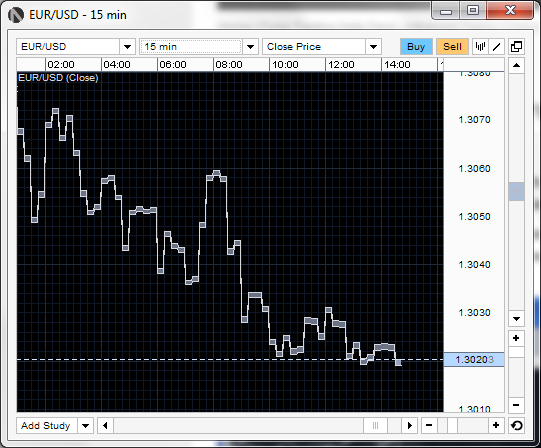
The currency rate graphs used in the OANDA platform shows you how currency exchange rates change over a period of time, ranging from minutes to months. All charts are updated in real time as OANDA sends out our latest currency rates.
 Currency graph quick start
Choose your currency pair
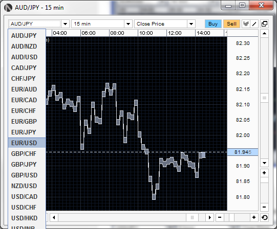
Use the top left drop-down menu to choose the currency pair (for example, EUR/USD or USD/CAD):
To choose which pairs are available in this list, go to Tools > User Preferences > Rates .
 Set time period granularity
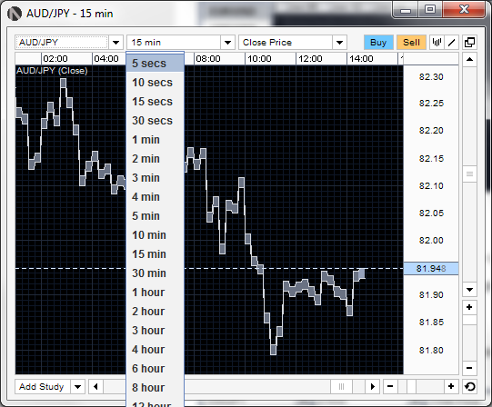
The purpose of using different time periods is to focus on short-term vs. long-term trends. To set the time period granularity shown on the graph, use the second drop-down menu at the top left:
Choose from a time period granularity ranging from five seconds (the finest granularity, which graphs prices for roughly the last 40 minutes), to one month (the largest granularity, which graphs prices for roughly three years).
 Specify the graph type
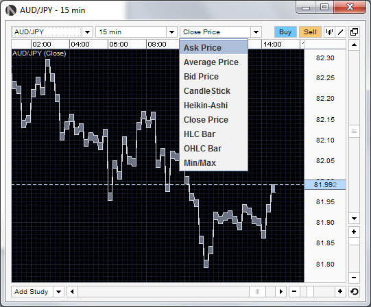
Use the third drop-down menu from the left to choose the type of line that's plotted on the graph.
 Graph type
Ask![]() The prevailing sell price. price - Average price - Bid
The prevailing sell price. price - Average price - Bid![]() The prevailing buy price. price
The prevailing buy price. price
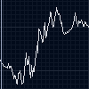
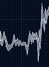
A line showing one of the ask price, average price, or bid price.
If these lines were all plotted on the same graph, the ask price would be higher than the other lines, the bid price lower, and the average price midway between the two.
Example
 Candlestick (bid candlestick/ask candlestick)
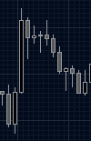
Candlesticks show the open, close, maximum, and minimum prices for each period. The standard candlestick chart is drawn using average prices; versions displaying bid and ask prices are also available.
The body length of the candlestick shows the relative change in the open and close rates for the reporting period. The longer the body, the more volatile the swing between the open and close rates.
A hollow candlestick points to a rising trend: the bottom of the body represents the opening rate, while the top shows the closing price. A filled candlestick shows a decreasing trend, with the opening rate at the top of the body and the closing rate at the bottom.
The top end of the upper vertical line represents the average of the highest ask and bid rate reached during the interval; the bottom end of the lower vertical line represents the average of the lowest bid and ask rate reached during the interval.
Example
 Heikin-Ashi
The Heikin-Ashi (meaning "average bar" in Japanese) is a modified candlestick chart where the open-high-low-close (OHLC) values take the previous period into account to better isolate trends. Other than using different calculations, the chart acts and looks the same as the candlestick chart.
OHLC values are calculated from midprice values as follows:
- Open: The midpoint of the current Heikin-Ashi open and close values for the previous bar
- High: The high (or the Heikin-Ashi Open if it was higher)
- Low: The low (or the Heikin-Ashi Open if it was lower)
- Close: The average of four bar prices: open, high, low, and close.
Example

 HLC (High-Low-Close) bar
The HLC bar shows highs and lows for each period using a vertical bar, with a horizontal tick to the right showing the closing price.
The highest point of the vertical bar represents the average of the highest bid and ask rate reached during the period; the lowest point represents the average of the lowest bid and ask rate. The horizontal tick represents the closing mid-price for the period (that is, the sum of the closing bid and the ask rate divided by two).
Example
 OHLC (Open-High-Low-Close) bar
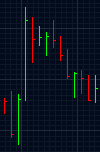
The OHLC is similar to the HLC bar, in that it shows highs and lows for each period using a vertical bar, with a horizontal tick to the right showing the closing mid-price. It also provides a horizontal tick to the left, showing the opening mid-price for the period.
Example
 Minimum/maximum chart
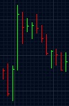
The minimum/maximum chart plots the minimum and maximum prices for the interval chosen. The upper boundary represents the maximum ask price, while the lower boundary represents the minimum bid price.
The minimum/maximum chart is different from the closing price chart because minimum and maximum prices may not be the opening and closing prices for that interval.
Example
 Add price lines
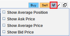
Click the Chart Options button (located near the top-right corner above the graph) to add horizontal lines on the chart so you can track the current ask price, average price, or bid price. Select show average position to add a horizontal line showing the average position of your current trades for the currency pair shown in the graph. Your average position is shown in the positions table .
Seeing these lines may help you track the status of your trades, because you will see when the current price is approaching trading activity symbols or your average position.
 Move in, out, and around the graph
Scroll: The scroll bars are located on the right and at the bottom of the graph. Use them to see information that is hidden from view.
Zoom In/out: zoom to change the level of detail displayed and use different perspectives to better understand short-term and long-term trends. Zooming does not change the granularity of the graph, only your view of it. The price (vertical) and time (horizontal) zoom controls are located at the bottom right corner, next to the scroll bars. Click plus (+) and minus (-) or buttons to zoom in or out respectively. Or, use the slider bar to manipulate the zoom level.
Reset: The back button on the bottom-right corner resets the graph view to default scroll and zoom settings.
 Return the graph to a default view
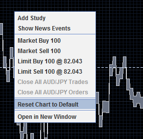
Click on any empty part of the graph. Select 'Reset Chart to Default'.
(The graph is returned to default settings, with all colors, studies, and trendlines removed.)
 Place a trade from the graph
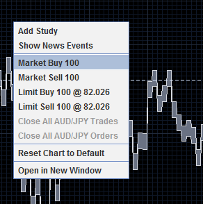
Click on any empty part of the graph. Place your trade from the menu that appears:
The entry order price field is filled with the value of the current cursor position.
 Open the chart in a separate window
Open the current chart in a new window: click the windows button in the upper right corner of the chart.
Open a new chart for a different currency pair: click on the currency pair codes in the Rates List
 Hide or simplify the chart
To hide the chart , de-select the check box at Tools > View > Graph.
For a basic chart view where scroll bars and other controls are hidden, click the Chart Options H button located at the top-right corner of the graph and select Basic Chart View from the menu that appears. (The menu choice changes to Advanced Chart View; select it to return to the default chart view.)
 Change colours
To change the colour of the graph , click directly over the exchange rates being plotted on the chart. A menu appears with a list of colors.
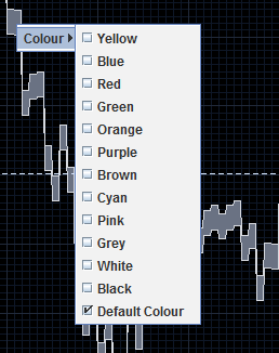
To customize the colors used in the interface (including the colors used in this menu), select Tools > Color Scheme > Edit Custom Theme.
 View additional information
- To see news events superimposed on the chart so you can follow the important economic announcements and events that can affect your forex trading, select Show News Events from the right-click menu. News events are marked by flags at the bottom of the rate graph. (Click on a flag to view news details in the News tab.)
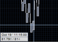
- A set of crosshair lines follows your mouse to indicate the price and time. (You can turn off either the horizontal or vertical crosshair lines in the chart tab of the 'User Preferences'.)
- The Graph Information Box in the lower left corner of the graph shows precise exchange rate information for the current cursor location. This information varies by chart type.
 Print the chart
To print the chart , click the Chart Options button located at the top-right corner above the graph and select Print from the menu that appears.